Sales Dashboard Project
View the Sales Dashboard Project
The project includes all stages of working with data in Power BI: importing data,
transforming data in Power Query Editor, building a data model, adding calculations
using DAX, implementing high-quality and interactive visualization with filters
and KPI cards.
This project used the test data set Financial Sample.xlsx from Power BI, which was
transformed into Power Query.
When transforming the data, redundant columns were removed, the date column was moved
to the beginning, the data type in the sales column was changed to currency,
the name of some data and digits in the number columns were adjusted.
Since there was no certainty that the dates in the transaction date column of
the existing table are placed in the correct sequence, a new Calendar table was
created through the CALENDER(StartDate, EndDate) formula, starting from the minimum date
in the date column of this table to the maximum date in this column.
In the data model, two tables are joined by the date key.
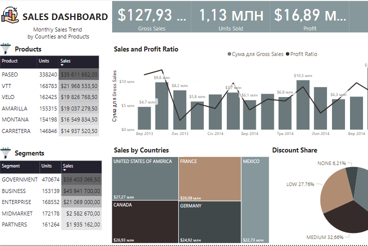
For data visualization, a combined version of a bar chart with a linear curve
(the ratio of profit to total sales) and an additional axis for the profit ratio
was created to obtain the dynamics of sales over time for each month.
To obtain the ratio of profit to total sales, a custom formula is applied in the simulation,
placed in a new _calc table, which is a container for all created measures (formulas).
Next, the table is filled with the measure (profit ratio or sales margin)
Profit Ratio = DIVID(SUM(financials[Profit]);SUM(financials[Gross Sales]))
Also added are cards with total sales, number of goods sold, total profit (revenue),
profit ratio as a percentage.
For the possibility of data filtering, a table with sales by various products
(Product, Units Sold, Gross Sales), a table of various sales segments
(Segment, Units Sold, Gross Sales) has been added
To show the share of sales of each country, a Treemap (Country, Gross Sales) diagram was
created
A pie chart (Discount Band, Gross Sales) with a legend of the category and its percentage
has been created to display discounts.
In the report settings, the value "change visual effect from underline to cross filtering"
is activated, so that when filtering data, the visualizations change in relation
to the selected data.
