CO2 Project
The project includes the following steps for working with data in Tableau: importing data
from different sources and connecting them, data transformation, implementation of
high-quality and interactive visualization with filters.
CO2.xlsx, Energy data.xlsx, totalpopulation.xlsl, gdptotal.xlsx data sets from various
sources were used in this project. The relationships between the different datasets were
created using an INNER JOIN through the Year and Country columns between the CO2 Data
Cleaned table of the CO2.xlsx dataset and the Energy data.xlsx, totalpopulation.xlsl,
gdptotal.xlsx datasets.
The data was transformed (the data types were changed to the appropriate ones: numeric
to date for date columns in sets, in Energy use columns from text to Number (decimal),
in currentGDP columns from text to Number (whole))
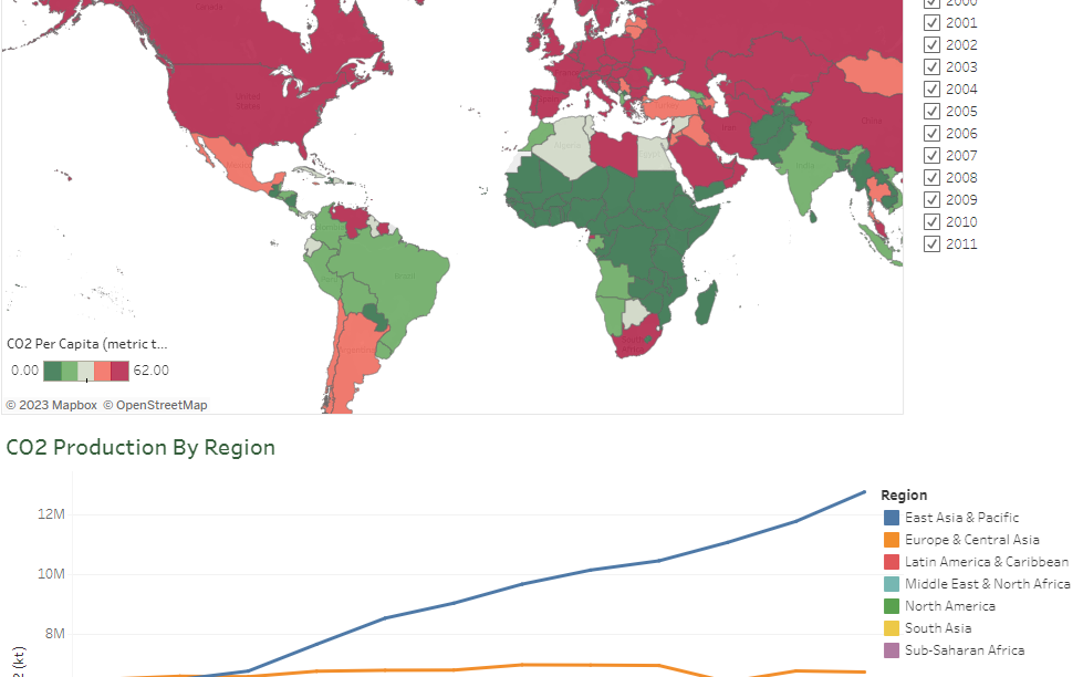
The dashboard consists of 2 visualizations:
a map showing CO2 emissions per capita with a color transition from red for high-emitting
countries to green for low-emitting countries filtered by year,
linear chart of CO2 emissions by region by year.
The data in the dashboard is filtered by years, countries and regions. Visualizations
also act as filters.
Business task:
For a policy research institute, this project required the creation of visualizations
showing CO2 emissions per capita for each country and region for the years 2000-2011.
The visual presentation should make it possible to visually compare CO2 emissions between
countries and regions from year to year, as well as provide information on each country's
population, GDP and energy consumption.
