Athens Project
The project includes the following stages of working with data in Tableau: data import,
data exploration, implementation of qualitative and interactive visualization with filters.
The Athens Airbnb Data.csv dataset was used in this project. The set contains data that looks
like an outlier, but at the same time, it can reflect the real picture of expensive apartments.
When in doubt, it would be appropriate to take not the average value of the rent,
but the median. But, since the customer insisted on the average value of the rental price
in order to understand all possible options, the average value is reflected in the analysis.
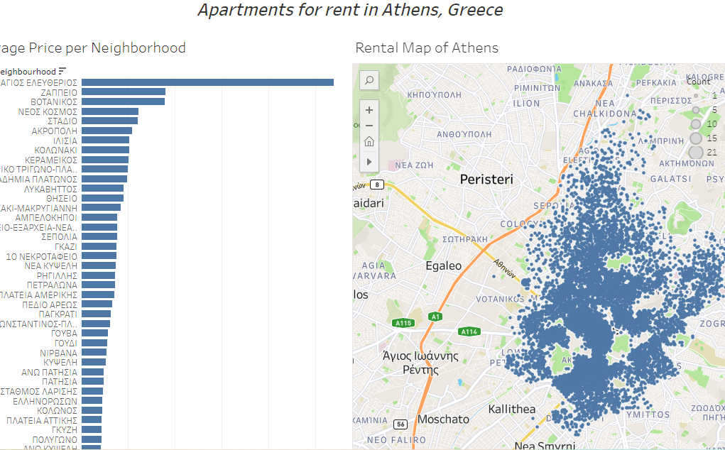
The dashboard consists of 2 visualizations:
bar chart of the average rental price of apartments by district of the city,
a map that visualizes the concentration of rental places in Athens to understand the most
popular locations and the availability of apartments by district of the city.
Data in the dashboard are filtered by city districts.
Business task:
For a company that buys properties in a certain district, turns them into rentals and offers them
to people on vacation in Athens, Greece, they needed to create a visualization based on data
from Airbnb about the city's rental properties. This data includes the price to stay at each
property, the length of each stay, rental locations, and more.
The diagrams had to answer the following questions:
- What is the average price per night in each district?
- Where in the city is the largest concentration of currently available rental places?
